
Pets for Vets (Awareness Campaign Landing Page)
Design Research | UX/UI | Responsive Web Design
Tools: Figma, Adobe Illustrator, and IDEO Human-Centered Design
Overview
Landing pages are all about conversions. How do I inform the user quickly and get them to do a specific task? (sign up, volunteer, donate money, learn more, share on social media, etc.). For this project, I was tasked to create a responsive landing page to convert users for an organization of my choice.
Problem
Although the Pets for Vets website offers in-depth information, users may have a hard time finding where to start their application. Because of information overload, I needed to think about how to provide a straight-to-the-point approach to adopting a life-changing companion.
Goal
I wanted to create a landing page that will give an overview of the application process and allow users to jump right into filling out their application. By accomplishing this task, Pets for Vets can continue to share non-medical and therapy-related resources for veterans after service.
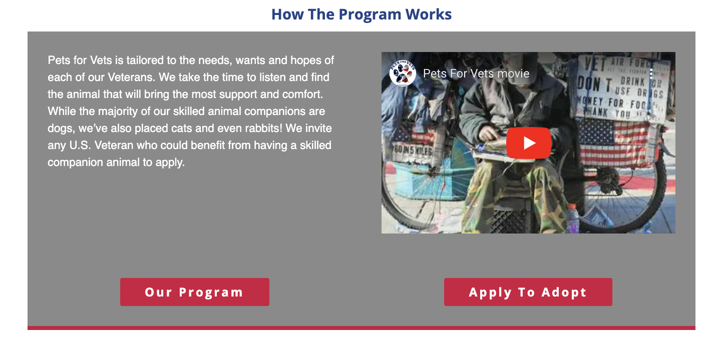
What is Pets for Vets?
Pets for Vets is a non-profit organization that provides a second chance to shelter animals by rescuing, training, and pairing them with American veterans who may need a companion pet. The program is dedicated to improving the mental well-being of veterans who are transitioning into civilian life. Through their Super Bond® process, they are able to pair the right pet with the right Veteran!
Current Website Analysis
When I first looked at their homepage, I was overwhelmed with the amount of information provided. If someone visited this website for the first time to begin an application, they may overlook key bits of information about the application process.
I felt that a landing page could increase conversions rates by providing simplified bits of information and easy access to the application process. If user’s are still unsure about if they are ready to begin an application, the landing page can still provide important information about the Pets for Vets’ application process.
Competing Information
Having 2 call-to-actions that lead to different outcomes next to each other may result in frequent misclicks and errors in the intended user flow. The 2 buttons also compete with the YouTube video (which makes this section require the user to make a decision between 3 options).

Important Information May be Overlooked
To apply for a Skilled A.C.E. Trained Animal, visitors must live in a state with a Pets for Vets chapter. The main way to view the list of chapters is in the header, but its thin bar does not allow it to stand out and may be overlooked.

Application Requirements Are Hidden Within the Site
To view the full list of requirements to apply, users must click the “Apply” tab. This may be confusing to some users as they may not be ready to apply, but are unaware where else to find key information they need before applying.
Who Would I Be Designing For?
Through research, I was able to narrow down my target audience to Veterans (men and women) between the ages of 45-65. I shifted my focus to those who are animal lovers and looking for a way to connect back with society, while improving their mental health.
-
Age Range
Largest Group: 45–65 years old
Average Age: 58 years old
-
Gender
Females: 9.67% of Veterans
Males: 90.33% of Veterans
-
Location (Pets for Vets Chapter States)
Colorado, Connecticut, Delaware, Florida, Georgia, Idaho, Illinois, Indiana, Maine, Maryland, Massachusetts, Minnesota, Nevada, New Jersey, New York, North Carolina, Ohio, Pennsylvania, Wisconsin
-
Key Interests
Mental health awareness
Animals (owners and lovers)
Transition back to civilian life
-
Extra Areas of Exploration
Financially stable (able to maintain a pet)
Low to medium tech knowledge
Small household size
-
Target Audience
Men and Women between the ages of 45–65 years old who are retired veterans living in a state that has a Pets for Vets chapter.
This group includes animal lovers who are looking to connect back with society and improve their mental well-being.
Empathy Mapping
I based my empathy map on stories left by Veterans who have made successful parings with Pets for Vets. The stories they shared motivated me to create a landing page that allows other Veterans to experience what it is like to be paired with their own companion pet.
Avatar provided by Pablo Stanley via blush.design
Persona Creation
I created a persona for a Combat Veteran who wants to relieve the stress they felt while searching online for life resources. Robert’s key frustrations and technology pain-points highlighted aspects that I should avoid in my final design.
Ideating From a Story
To gather an idea of how a veteran may come across the projected landing page, I created a storyboard to illustrate Robert’s journey of looking for mental help resources online. I was able to identity aspects that may prevent users from continuing their journey and what language could be used on the landing page.
How Might We…
I identified the main challenge I needed to accomplish: Provide a straightforward approach to adopting a life-changing companion. After generating statements based on the journey and website experience, I assigned them a priority in which they would influence my final design. By narrowing my HMW statements, I was able to remind myself that I was designing a landing page (preview) rather than the website (in-depth).
Brainstorming Solutions
I ideated different ways I could implement the statements on my landing page and highlighted what I thought could be the best idea per statement. I found that some ideas overlapped with other HMW statements and could be a solution to both statements.
Accessibility: Designing for an Older Audience
I consulted several studies and articles about usability for older audiences and found 3 key takeaways I wanted to employ in my designs. I was excited to see that many of the recommendations made an appearance in the list of generated ideas I developed while brainstorming solutions.
Visual ElementsFonts should be a minimum of 16px
Sans serif typefaces are preferred for on-screen readability
Icons should be labeled with text whenever possible
Contrast and Colors Don’t rely on color to convey messages
Keep a contrast ratio of at least 4.5:1 (best to stay over 7.0:1)
Check designs by using online visual impairment simulators
Layout and StyleIncrease contrast, but avoid light colors on dark background
Increase the size of the area around links to enhance use
Centered text (other than titles) should be avoided
Responsive Design
Because the landing page may be viewed on devices, it was important to create consistency across platforms. I worked with hierarchy considerations in mind and used a flexible grid system to clarify grouped contents, their order, and group priority.

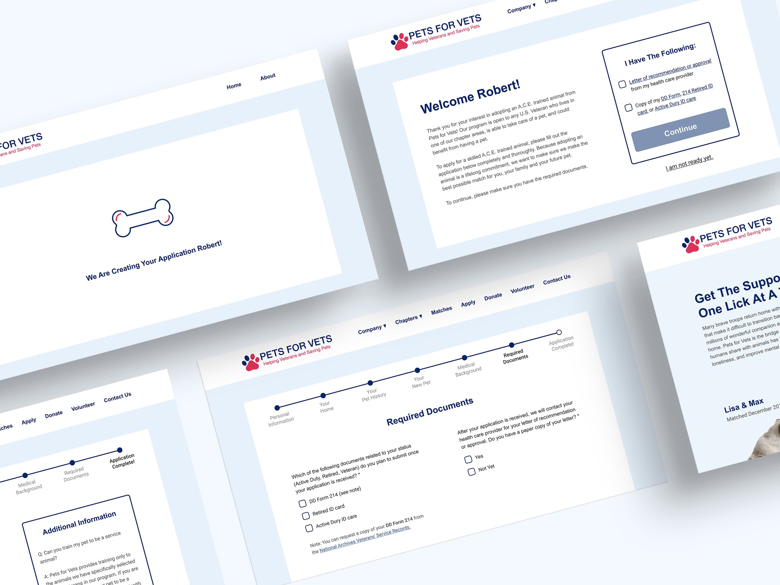
Exploring the Landing Page
Now that the landing page is complete, lets take a look around and see Robert begin his application for Pets for Vets!
To view the prototype, click here!
To view the prototype, click here!
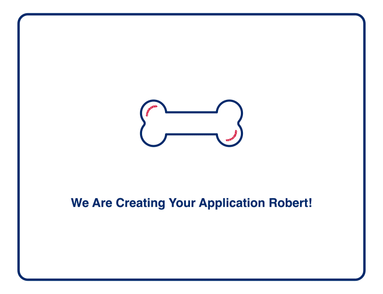
A Closer Look: Adding Motion
I animated a pre-loader screen to let Robert know that is information is saved and his application is being generated.
Beyond the Landing Page
After animating the pre-loader for generating the application, I decided to redesign their application portal. Not only would this keep the design consistent, it would also limit distracting elements found on the original application tab of the website. To make applying easier, I wanted the Robert’s answers from the lead capture to carry over to his application.
To view the prototype, click here!
To view the prototype, click here!
Project Reflection
I really enjoyed this project as I was able to explore a target audience that may often be overlooked in the design process. Learning about designing for an older audience makes me want to explore the other end of the design spectrum and designing apps and products for children. This was also one of the first projects I implemented responsive web design principles. I quickly realized that it is more than just making things bigger or smaller between devices, but about reordering elements to keep hierarchy consistent.