
MealChange (Healthy Recipes + Easy Grocery Shopping)
Design Research | UX/UI | Google UX Design Certificate Project 3
Tools: Figma, Adobe Illustrator & Maze (images provided by unsplash.com, nappy.co, and buildyourbite.com)
Problem
Many people struggle to maintain healthy cooking habits due to factors such as time management, lack of interest, and little confidence in the kitchen. Food that was purchased from a previous grocery run may go to waste or be forgotten about. For those who want to use ingredients before they expire or limit food wasting, they often struggle with finding recipes tailored to their tastes and health accommodations.
Goal
A central goal is to provide a tool to reduce food waste and increase interest in healthy cooking. Not only should this tool accommodate various eating habits, but it should also tailor to specific needs of the user. My goal is to provide a flexible, interactive experience that motivates people to take part in a healthy lifestyle, while keeping them engaged in the kitchen.
Outcome
Mealchange provides healthy recipes and streamlines the grocery preparation and meal prep processes. The app can also suggest healthy meals based on what users already have in their kitchen. The mobile app will be paired with a responsive desktop & mobile website to create a seamless cross-platform experience.
New Interest in Healthier Cooking Habits/Methods
Within the last several decades, preparing meals at home has become less popular and more people have restored to dining out or ordering delivery for meals. At the same time, more and more people are starting to become concerned with weight and daily dietary habits. The positive aspects of preparing meals at home are growing popularity, but there are few tools that meet the needs of unique individuals.
This leads to the key question:
“We can easily find the benefits of eating healthier, but why are there so few resources and tools available to help people reach their goals at home?”
What are Current Habits and Mindsets?
To begin connecting with my audience, I sent out a survey to anyone between the ages of 18 and 45 years old. My goal was to gather background information about how this group views healthy eating and what their current healthy cooking habits are. After analyzing the results, I found out that this group had a solid foundation, but needed help to accomplish all of their goals and satisfy future needs.
-

90% of participants stated that learning how to cook healthy meals was important to them
-

On average, those surveyed cooked at least 3 healthy meals a week
-

60% of respondents wished they could cook more healthy meals a week
-

Time Management was the biggest setback as to why participants had a hard time cooking healthier meals
-

70% identified Nutrients as a key identifier when deciding if a meal is Healthy or not
-

Most respondents had not tested any websites or apps to transition to a healthier cooking style
What’s on the Market Now?
When promoting a healthy lifestyle, most tools focus on meal-based subscriptions, weight loss aids, and/or diet trends. I decided to take an approach that is more user-centered and explored resources that focused on helping users make decisions based on their own goals and available ingredients. Although these resources have individual strengths, as a whole they lack a true connection to the user. (something I can take advantage of).
View the full audit report here.
-

MealBoard (Direct)
Strengths:
• Sync between devices
• Export meal plan to calendar
• Helpful hints & directions
Weaknesses:
• Inconsistent navigation
• Limited base recipe list
• Lack of clear hierarchy
-

eMeals (Direct)
Strengths:
• Allows for grocery pickup & delivery
• Customizable weekly meals
• Consistent between platforms
Weaknesses:
• Cannot create a recipe custom list
• Lacks accessibility customization
• Cannot access without a credit card
-

MyFitnessPal (Indirect)
Strengths:
• Able to track daily diary entries
• Customizable dashboard
• Detailed workout plans
Weaknesses:
• Large/distracting ads
• Inconsistency across platforms
• Tailors only to exercise & fitness goals
-

Tasty (Indirect)
Strengths:
• Community involvement with blogs & updates
• Focuses on finding recipes
• Several entry points to main flow
Weaknesses:
• Slightly distracting, image heavy website
• Unnecessarily long homepage
• Crammed top navigation (mobile)
Who Should I Be Designing For?
Like those surveyed, Kristian struggles with food waste between grocery trips and wants to increase the number of healthy meals she cooks a week for her family. Because finding time to cook healthy meals can be a struggle without proper time management and resources, I set out to create MealChange to be the ideal solution.
Generating Statements + Ideating Solutions
Taking observations from the Competitive Audit, I generated statements to help lay the foundation for my app. I narrowed in on what the competitors lacked to identify gaps in the market. These holes can help my app stand out and further meet the needs of the user. By incorporating features that other apps have, users from other platforms can easily transition into a new app.
Sketching a Foundation
By sketching a rough walkthrough of the main user flow, I was able to imagine how a first-time user would take their first steps toward preparing their first meal with MealChange. The intro questionnaire and initial inventory check helps set the foundation for the app. Afterwards, the user is able to view recipes that feature all or most of the ingredients in their pantry. If they are missing ingredients, the recipe can be sent to the shopping list for a future grocery run.
Prototypes + Usability Testing
I conducted an Unmoderated Usability Study through Maze where 6 participants were asked to perform and provide feedback for 3 tasks using the Low-Fidelity Prototype. The results from the test yielded 3 Research Insights that called for changes to be made to the main user flow.
To see the full Usability Study and Analysis, view my Process Deck.
P0 Insight: Stronger Navigation Indicators for Account Creation
P1 Insight: Introduction Questionnaire layout lacks clarity
P1 Insight: Highlight Important Information Within the Ingredients List
First-time Users Need Clear Access to Account CreationImplementation: To ease the struggle with account creation, a welcome page was added to guide first-time users into creating their account.
How Many Options That Could be Selected was UnclearImplementation: To streamline the questionnaire, answers to the questions were changed to a list format with checkboxes to indicate that more than one option can be selected.
In-stock Ingredients Were Hard to IdentifyImplementation: To indicate which ingredients the user already has in their kitchen, a checklist feature was implemented and in-stock ingredients are pre-checked off.
Accessibility Considerations
Including Accessibility Design features helped extend MealChange to a larger audience and create an interface that allows for visual clarity and navigation.
Highlighted Navigation and IconsNavigation and icon text indicators were added to aid in recognition and navigation.
Control Color ContrastUsers are able to change the interface colors (and contrast) and display fonts within the app settings.
Visual Hierarchy & ClarityAn alternate layout of the recipe cards is available within the app settings for users who may have a hard time reading the text on the recipe image.
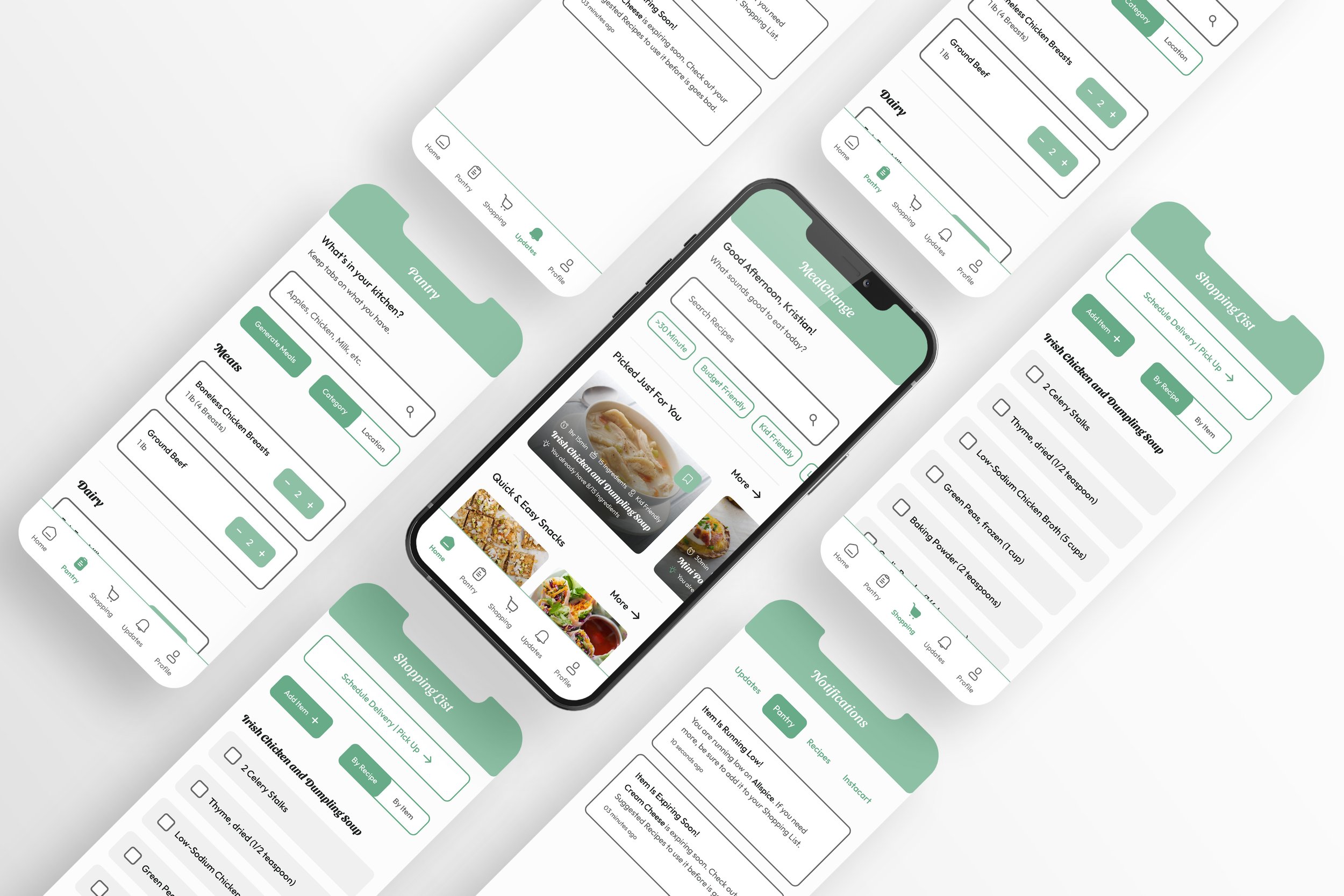
Final Outcomes: Key Features
Here is a preview of MealChange’s key features that enhance its user flow to accomplish goals that the users wishes to accomplish. Not only do these features help MealChange provide a personalized experience, they also bridge the gap between between competitors and extend usage to a diverse group of users.

Pantry Inventory
When adding items to the pantry list, users start with entering the name of the item, then add key details to help with maintaining inventory. These details play a major part in generating recipes with in-stock ingredients and keeping users up-to-date with what is in their kitchen between grocery runs.

Recipe Breakdown
Quick Access: Users can send the recipe to their Shopping List, Bookmark the meal for later, or enter Cook Mode to prepare the meal.
Ingredients: By adjusting the servings, ingredients will automatically update to accommodate changes. Ingredients that are already in the pantry are checked off for easy identification.
Directions: A step-by-step breakdown of the directions are featured in a checkbox list to ensure steps are followed in order.
Nutritional Information: Key information is listed per serving for users who want to track their nutritional facts per meal.

Shopping List
When recipes are added to the Shopping List, they can be organized by individual recipes or broken down by each ingredient. If shopping in-store, items can be checked off to indicate they have been added to the shopping cart. For others, easy access to scheduling delivery or pickup is located at the top of the screen.

Personalized Updates + Notifications
Via the Notifications tab, users are kept up-to-date with several key features such as newly added recipes, inventory/pantry updates, and quick access to discounts and coupons.
See the MealChange App in Action
Now that the dedicated mobile app is complete, let’s take a look around and see Kristian create her account and explore the many features MealChange has to offer.
To view the prototype, click here!
To view the prototype, click here!
Creating a Cross-Platform Experience
To accommodate users on multiple platforms, I designed a responsive website to pair with the app. To allow for a seamless cross-platform experience, the website has many of the same features of the app to allow handoff between devices. Kristian can save recipes on her phone and pick up in the same place on her laptop for easy access to recipes while in the kitchen.
Continuing the Experience on Desktop
After a successful grocery run, Kristian is ready to prepare her first meal with MealChange and explore more features it has to offer.
To view the prototype, click here!
To view the prototype, click here!
Project Reflection
What I LearnedA major thing I learned during this case study was designing a cross-platform experience that utilizes both a mobile app and a responsive website. This allowed me to consider what was more important to highlight in an app versus a responsive website. I was able to make design choices by thinking about which platform users would be accessing the app.
With More Time & ResourcesWith more time I would love to further experiment with ways to design the Cook Mode feature. I would like to add a running transcript underneath the video and interactive points within the video so users can make sure they are following the directions currently. With more resources, I would like to explore the partnership aspect of MealChange with other companies and businesses.