East Brooklyn Art Museum (Art Auction App)
Design Research | UX/UI | Google UX Design Certificate Project 1
Tools: Figma & Adobe Illustrator (images provided by unsplash.com)
Overview
The East Brooklyn Art Museum is a community driven art museum located in Brooklyn, NY. Every month, the Museum hosts its popular art auctions to promote local artists and their works.
Problem
The auctions hosted by the East Brooklyn Art Museum have been moved online due to the impact of COVID-19. As a result, museum members and art lovers need a new way to bid and purchase their favorite artworks.
Outcome
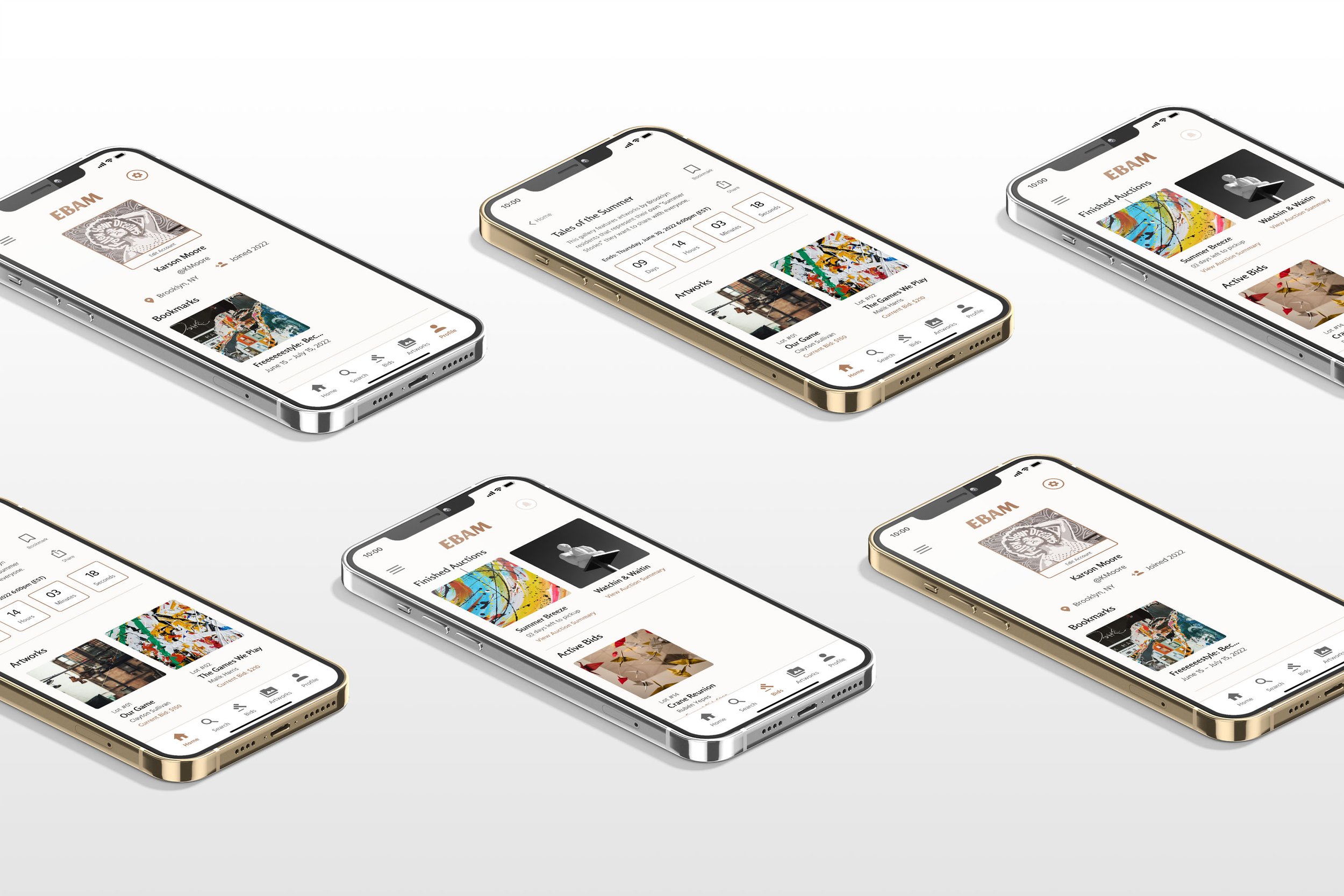
I created an app that would allow users to continue to participate in the museum's auctions in an online setup. The main goal of the app is to aid users in being able to place a bid on their chosen artwork, claim their winning artwork, and purchase the artwork.

How Has the Pandemic Affected Art Museums?
Art Museums around the world were surveyed in the Spring and Fall of 2020 to asses the impacts of Covid-19. From a steep decline in visitors to potentially facing the closure of exhibitions, museums have faced many hardships during the Pandemic. With most museums having to move their exhibitions online or canceling them all together, is there a way to return audience engagement levels to pre-pandemic heights?
-

Museums reported a loss of more than 50% of their annual visitors
-

A threat faced during closure was losing contact with the local community
-

Only 3% adopted paid online exhibitions to generate income
-

A potential long-term economic impact on museums was reducing the number of exhibitions
-

77% wanted to rethink their digital strategy methods after lockdown
-

Developing digital/hybrid events was a skill museums felt was needed during the pandemic
What Tools Are Available for Art Lovers?
Many apps exist to host online auctions, but most are known only by frequency users or are managed by private art galleries. During the pandemic, small art community platforms gained traction and maintained a steady presence online. Could this method be applied to the community driven East Brooklyn Art Museum?
View the full audit report in my Process Deck.
Strengths
Artwork authentic checker
Incentives for first time buyers
Short and to the point artwork descriptions
Weaknesses
Accessibility (only available language is English)
Unclear steps on how to attend online auctions
No clear brand color, voice, style, or identity
Strengths
Overall clean and clear design
Able to change languages and currency
Consistent designs and brand voice
Weaknesses
Accessibility (only available in dark mode)
Long periods between bidding
Limited or hard to find information (shipping information)
Strengths
Clear and easy bidding process
Wide variety of collections
Simple and secure checkout
Weaknesses
Accessibility (small text sizes for some key information)
Overwhelming pages (little negative space)
Style is simple and dull
Connecting with the Community
I was able to talk with Local Artists, Community Members, and Art Museum Attendant to understand their needs and frustrations with the current EBAM Auction process. All groups expressed similar concerns and I uncovered 3 major painpoints when it comes to the overall auction experience.
Painpoint 1: OrganizationAll groups identified organization as a major obstacle to a successful art auction at EBAM. Many felt that the current structure can easily become disorganized, which often leads to confusion and headache.
Painpoint 2: TransparencyArtists and Community Members felt that the Museum was not clear on where the money goes after an auction. Community members were unhappy about hidden fees, while artists felt that they were cheated out of the amount of money they received from selling their art.
Painpoint 3: CommunicationCommunication between all groups was a major issue. Everyone felt that stronger communication was necessary for a smooth experience and would eliminate obstacles that arise during the auction process.
Consolidating the Audience
User Personas played a key role in helping me narrow down which audiences I should be designing for and what role they would play when interacting with the app. By listing each groups frustrations and goals, I quickly realized that trying to address 3 group’s frustrations would be hassle to cover with just 1 app.
Who Am I Designing For?
I narrowed down my target audience and prioritized the design direction my app would take. Because the frustrations of the Community Members and Local Artists could be addressed simultaneously (direct), they became the main focus of my app. The frustrations of the Gallery Attendants would be addressed via means that would fall outside the scope and purpose of my app (indirect). By having a strong foundation for this app, the stress for Gallery Attendants during auctions would be reduced as the app would facilitate the main components of the auctions.
Primary Audience: Community MembersCommunity members were defined as the main target audience for this app. This user group includes anyone (Brooklyn resident or not) who is willing to participate in or view any EBAM Art Auction.
Secondary Audience: Local ArtistsLocal Artists would also be addressed within this app. Artists would be able to sign-up for shows and manage their artworks within their own tab after registering as an Artist. This allows everyone to participate in.any EBAM’s art auction.
Future Exploration: Gallery AttendantsEBAM Gallery Attendants would be addressed via a separate app or web application that will allow them to organize and manage different shows and events that appear on the main app. With more time, I would love to make this happen!
Uncovering Hidden Obstacles
I created a Journey Map to simulate Karson’s journey of participating in an EBAM art auction and highlight potential issues and areas of improvement for the user experience. These areas were flagged and labeled with a design tip or solution to the issue at hand.
Mapping Out a Plan
Paper Wireframes were designed to envision a rough walkthrough of the main user flow. I highlighted the screens that were the most successful and placed red marks on the elements I wanted to keep in the digital wireframes.
Wireframes + Usability Test 1
I conducted an Unmoderated Usability Study where 5 users were asked to perform 4 tasks using my Digital Wireframes. The results from the test yielded 4 Research Insights that influenced changes that would keep my user flow consistent. To see the full Usability Study, view my Process Deck.
P0 Insight: Stronger Navigation Indicators
P1 Insight: More currency options for bidding
P1 Insight: More payment options for checkout
P2 Insight: Seek more ways to create an account
Navigation Needs Stronger IndicatorsImplementation: New screens feature a button label indicating what the previous screen was. This allows users to see what this button does and gives the button a larger touch window.
Currency Options for Bidding are Limited (Current: $USD)Implementation: A highlighted indicator of the current currency option was added. Users can click the currency label to change the price to the preferred currency via a popup window.
Some Users May Need Additional Payment MethodsImplementation: Allow users to select the payment option they wish to use: Credit/Debit Card, PayPal, Apple Pay or Afterpay.
Prototypes + Usability Test 2
To test the flow of my new designs, I conducted a Moderated Usability Study where 5 users were asked to perform 6 tasks using my high-fidelity prototype. The study generated 3 new key insights that would further help my design. Expanding account creation was decided against as the current layout only collects information needed to engage with the app. To see the full Usability Study, view my Process Deck.
P0 Insight: Modify the Hamburger Menu
P1 Insight: Simplify Iconography
P1 Insight: Further Highlight Important Information
P2 Insight: Seek more ways to create an account
Hamburger Menu Needs Minor ModificationsImplementation: The exit indicator was increased in size as well as the username text. (the hamburger menu icon was also increased in size on the homepage) The background to also changed to a different color that allows navigation and icons to stand out.
Showroom Iconography Needs SimplificationImplementation: The “Share” icon was switched for a more common icon. Text was also added below icons for more context.
Further Highlight Important InformationImplementation: The entire “Current Bid” line was changed to be one color to further highlight the information.
Accessibility Considerations
Implementing Accessibility Design mechanics helps extend usage of the app to a wider audience and was a key design feature I wanted to implement.
Color ContrastFont colors were analyzed for their contrast with the background color respective to their Text Size and User Interface Components via webaim.org.
Visual HierarchyNavigation and icon text indicators were added to aid in recognition and navigation.
Impairment AccommodationsUsers who are vision impaired would be able to access the app as alt text was added to images for screen readers.
Final Outcomes: Key Features
Before diving straight into the app, here is a breakdown of some key features to help you (and Karson) navigate the EBAM app. Many of these features bridge the gap between in-person and online art auctions and extend usability to an international audience.
Push Notifications
After signing up, Karson can enable push notifications so that she never misses updates about new shows, bid changes, and early bidding opportunities.
Currency Converter
With a simple click of a button, the current bid price can be converted to other currency options. Karson can now share the app with her friends in Canada and they too can participate in EBAM’s art auctions.
Artist Appreciation
Sending a thank you note to the artist is a great way to show your support and appreciation. The feature allows Karson to connect with Malik (the artist) in a similar manner to the previous in-person EBAM art auctions.
Search | Bids | Artworks | Profile
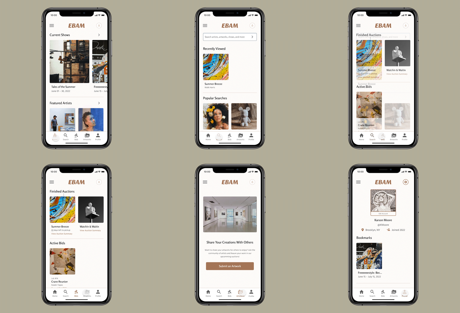
From searching for a specific medium to uploading your own artworks, the bottom tab bar offers important entry points within the app. Karson has already added a profile picture and participated in 2 additional art auctions!
Experience an EBAM Auction
Feel free to interact with this prototype and experience for yourself what it is like to participate in an East Brooklyn Art Museum Art Auction like Karson. Tap the screen to get started! Or click here, to open the prototype in a new window.
Suggested Walkthrough:
Enter your name and Sign Up.
Enable Push Notifications and view the “Tales of Summer” Showroom.
Check out the showroom and select the “Summer Breeze Artwork.”
Place a $350 bid and follow the steps to secure your bid.
Return home to view your new pending alert!
View your Auction Summary and proceed through the checkout process.
Arrange for pickup and continue with the saved card from placing your bid.
Review your Pickup Ticket and be sure to Thank the artist!
Return home and explore the bottom navigation tabs!
Project Takeaways + Next Steps
ImpactMany of the participants who tested this app were very interested in its concept and felt they would use this app frequently to participate in future auctions.
One quote from a study participant:
“Everything seems well thought out and very planned. The Gallery stood out to me the most. Adding the artist bio at the bottom was nice because I have a chance to see who made the artwork. Great Job!"
What I LearnedA major thing I learned is how important User Testing is in the design process. Because I was so used to looking at my own screens, there were some areas that users had issues with that I overlooked. Without feedback, some of these issues may have gone unchanged and hindered others who would use the app.
Next StepsI will continue to implement feedback and iterate on my high-fidelity prototype. I want to make sure users are able to place a bid on their chosen artwork, claim their winning artwork, and purchase their artwork successfully.
After final revisions and modifications have been made, my screens would be ready to send off to a development team to launch my app!


